In a previous article we looked at how to approach the cart abandonment problem. This time, we’ll take a deeper dive into one of the root causes of cart abandonment – the checkout process.
The checkout screen is the final piece of the purchase puzzle when visitors come to your site. It’s the very last step before a visitor becomes a customer. It is the culmination of all of your hard work, and is what ultimately puts money in your pocket. Having a slow, painstaking, overly complex checkout page can be the catalyst that results in your customers jumping ship, or rather their cart, and abandoning their purchase. Especially if you’re selling something non-tangible, like digital products or services.
Tweaking your checkout page to better fit the needs of your business, and customers, can have a significant impact on your revenue.
Why do you need to optimize your checkout?
Statistics from the Baymard Institute have shown that 28% of shoppers abandon checkout simply because of a “too long/complicated checkout process”. In a benchmarking study, they also found that the average US checkout flow contains 23.48 form elements shown, with 14.88 of those elements being form fields. Fourteen! By input field #10 customers will be wondering why they bothered with this tedious process, and by input field #14 they’ll be second-guessing their decision to purchase your product.
Take a look at your own website analytics. Where do you see the most visitors bounce from? It’s possible that your checkout page is one of the top pages from which visitors exit your site. Keeping the purchase process as simple as possible can help prevent that last-minute abandonment.
The aim is to make it so easy for customers to complete their purchase, they barely have time to think about it. Let’s look at how you can optimize your checkout to increase your digital product sales.
Keep it honest
When your customers reach the checkout page, the last thing they want to be greeted with are unexpected charges. According to statistics published by the Baymard Institute, taxes and fees that aren’t clearly communicated to customers prior to reaching your checkout page account for 60% of abandoned purchases.
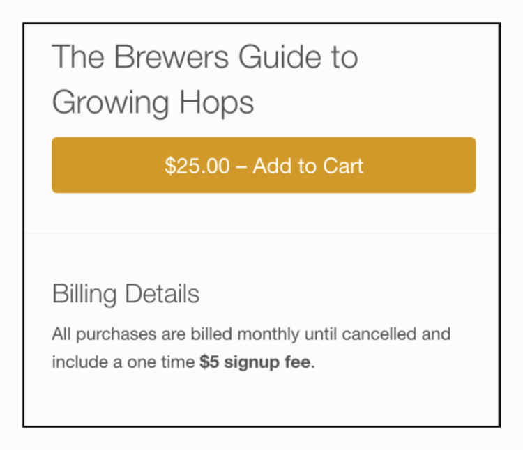
Include any applicable taxes or fees on the product page in a location that is easy to identify. While customers can still feign ignorance, you’ve done your best to prevent any ‘gotcha’ moments when it comes time to checkout. Being upfront with your customers will also help to instill their trust in your business.


If you have terms and conditions your customers will need to agree to, it’s also a good idea to present them with this information as soon as possible. Giving your customers an opportunity to review this information prior to landing on the checkout page is another way to eliminate unwanted surprises.
Keep it simple
This is the category where selling digital products really shines! Unlike an eCommerce business that sells physical products, digital products that are available instantly don’t require a shipping address or phone number. Street address, state, and zip code, are all fields you can immediately eliminate from your checkout form.
With each field you add to your checkout page you’re increasing the amount of time it takes a customer to give you money. You may also be increasing the fear and doubts a customer has regarding their purchase. Customers may find themselves wondering why you’re asking for their phone number, and just what you plan to do with it once you have it.
When configuring your checkout page, you’ll also want to review the order of your required fields. The email address should be one of the first pieces of information collected. By collecting the email address first, you’re able to target customers later if their cart is abandoned. Only show fields that are absolutely required.
The less a customer has to do, the more likely they are to complete a purchase. Keeping your checkout form simple and free of clutter is an easy way to put your customers at ease while they breeze through the checkout process.
Distraction-free design
As for the visual impact of your checkout page, you should remove everything that is not necessary. This same rule applies if you have a regular page or a pop-up/modal window.
Keeping your checkout page distraction-free is essential for increasing conversions while reducing cart abandonment.
Get rid of your primary (and secondary) navigation, remove your footer, remove any unnecessary images and overwhelming bright colours. Think clean and concise. Get straight to the point with your checkout form. Here’s a quick list of the basic elements you can include on a distraction-free checkout page:
- Show your logo or your brand/business name at the top (so the customer remembers where they are)
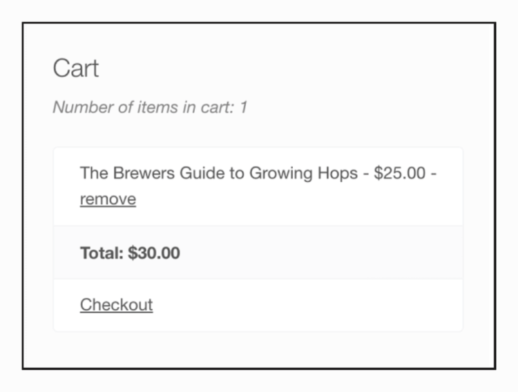
- Show the customer their cart contents one more time and the total price
- (Optional: allow them to enter a discount code or coupon if this is part of your pricing or marketing strategy)
- Add form fields to collect any personal details you need that are required for the purchase. At this point you can allow the user to log into an existing account, register a new account, or complete the purchase as a guest.
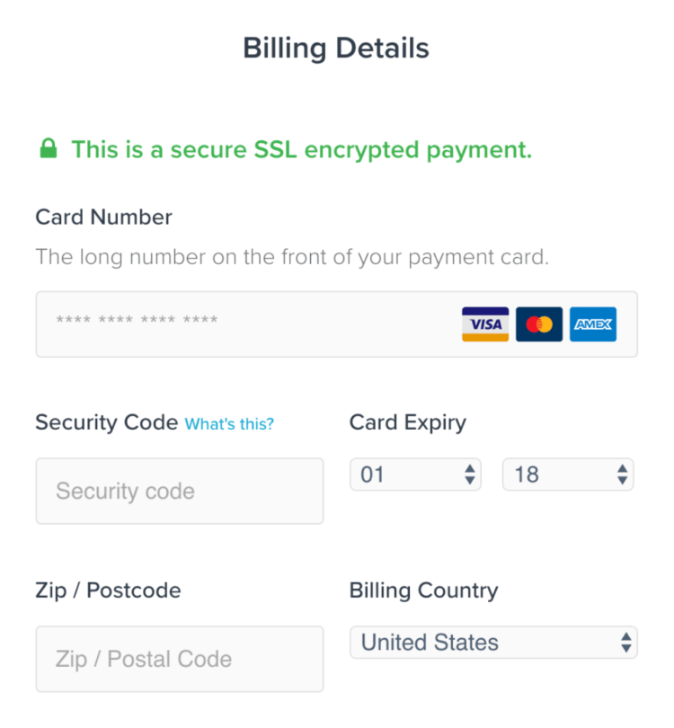
- Add form fields to collect the relevant payment information. Add fields for credit card details or provide details for other payment options you offer (such as bank transfer, third-party services such as PayPal, cryptocurrency, etc.)
- Provide a checkbox so the customer can accept your website’s terms and conditions
- And finally place a button at the bottom of the form that clearly explains the action the customer is about to take, such as “Purchase” or “Complete payment”.
Keep it secure
Collecting and maintaining personal data provided by your customers is a monumental responsibility. When a visitor is shopping on your site, and providing private information, they want to feel safe. A secure site not only puts your customers at ease; it can also help you convert more visitors into customers.
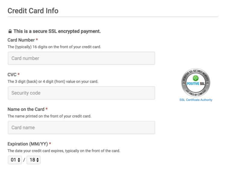
Trusted payment logos and trust badges / seals (if applicable) should be displayed prominently on your checkout page, along with accepted forms of payment. Displaying these images to your customers will increase their sense of security and trust in your site.

Savvy shoppers know to look for these visual cues and won’t complete a purchase on a site without them. If you don’t see a padlock in the address bar, and if your URL doesn’t start with https, you may be losing sales due to a lack of security.
Having an SSL certificate is like scrambling up your customers personal information and storing it in a safe. This makes the data that much more difficult for a third party to obtain and translate. If you’re accepting onsite payments, an SSL certificates is also required for PCI compliance.
We display a trust seal within the EDD checkout to further reassure users that our website is secured with an SSL certificate.

If your site isn’t secure, reach out to your hosting provider to learn about the available options. Trust me, your customers will thank you for it.
Keep it personal
Should you allow guest checkouts or require registration? This is an important question you’ll need to ask yourself and there is no right or wrong answer. The option you choose will vary greatly based on the type of products or services you sell. For some stores and product types, account creation may be a huge barrier to purchase.
Do you run a membership site with exclusive content? If so, your customers will be required to create an account to access all the premium material your site offers. Do you sell handcrafted coloring pages? Then customer registration may not be a necessity.
One way to encourage account registration is with an incentive. Offer a discount or a unique benefit if they choose to register an account. This makes the user feel less like they are signing up to yet another website, and they are getting something from the registration. It also means they are providing their permission to (securely) store the details they provide on your website.
Evaluate the products you sell and how your customers will interact with them, and your site, after they complete a purchase. There is no one-size-fits-all solution. Regardless of the option you choose, the process should be easy for your customers to navigate.
Keep it fast
Images and animations make your site visually appealing to visitors, but they can also make it slower. Increasing the number of components on your checkout page will result in increased load times and reduced customer satisfaction. They’re also completely irrelevant at this point. Eliminate distraction by removing unnecessary features from your checkout page, and stick to the basics. Don’t make your potential customer question their cart contents with unnecessary fluff.
A fast, simple checkout will also be significantly easier to use on mobile devices. Remember that more and more transactions are taking place on mobile devices, and a clunky mobile checkout might send a potential customer off to a competitor’s site. When resized on a desktop or used at a mobile or tablet resolution, your checkout should be tap-friendly and fast-loading. Take care with button sizing and input fields to ensure purchasing is a pain-free process.
You’ve already dazzled your customers with your products and services, now it’s time to get them across the finish line.
Finally, keep the faith
Regardless of how simple, safe, or speedy your checkout process is, it’s inevitable potential customers will still abandon their carts.
Converting visitors into customers while they’re still on your site will yield a better return than trying to wrangle them back in after they’ve left. While you aren’t likely to have a low inventory of digital products, you can still create a sense of urgency, or FOMO, at checkout. Offering customers an exclusive discount at checkout is one way to keep your customers engaged.
If customers do abandon their carts, all hope is not lost. Shopping cart recovery emails can be used to gently remind your potential customers that their items are still available and waiting for them to return. Offering a discount code in cart recovery emails will also increase the odds of a successful purchase.
Check out your checkout & recognize where to optimize
Optimizing your checkout process will help increase revenue, and customer satisfaction. While there are numerous ways to achieve this, some will fit your business needs better than others. Navigate your checkout process as a customer to identify potential sticking points. Was it simple? Was it fast? As a customer, would you be wowed by the experience? Test various changes to find the one that best suits your business.
What steps have you taken to optimize your checkout? Have you made changes that have improved sales? Which trust badges are you using? Drop us a comment and let us know!
Illustration by Jessica Johnston.
Using WordPress and want to get Easy Digital Downloads for free?
Enter the URL to your WordPress website to install.
Disclosure: Our content is reader-supported. This means if you click on some of our links, then we may earn a commission. We only recommend products that we believe will add value to our readers.
Hello, nice and useful post as usual.
I d like to share that there is a plugin called EDD Better Checkout Cart that removes some of the hassles EDD might have if you sell a single product per time.
it s on the wordpress depository:
https://wordpress.org/plugins/edd-better-checkout-cart/
Enjoy your better CTR!
Manolo
Aw, this was a very good post. Taking a few minutes and actual effort to produce
a very good article… but what can I say… I procrastinate a
lot and never manage to get anything done.
Hello! Thank you for the post. Currently my easy digital downloads checkout goes off the page. Is there any way you can help me keep the checkout on the page (for mobile) to increase my conversions.