Mobile commerce already accounts for nearly 40% of total eCommerce sales, and is projected to dominate at about 54% by 2021 – which means that you could be missing out on serious revenue if your site isn’t optimized for mobile use!
In addition to mobile devices commonly being the first point of contact between you and your customers, consider the popularity of smartphones, the growing presence of younger, increasingly mobile-savvy consumers, and a fast-paced, on-the-go, digitally-focused culture that demands more convenience and more efficiency by the minute. It’s easy to see the need for the mobile experience, but how does this translate specifically to digital product stores?
In this post, we walk through some of our recommendations for optimizing your digital product store for mobile use, so you can keep up with the times – and the sales!
Understanding the shift toward minimalism
Let’s rewind for a minute: It’s the early 2000s, and the advent of smartphones is putting a lot of pressure on internet service providers to adapt to increasing bandwidth consumption. Consumers are finally able to use the internet regularly while moving around – a huge lifestyle change that instigates a complete overhaul of how web content is presented.
It’s time to flip the script from impressive animations and graphic-heavy content, to web pages that can be loaded reasonably fast on less-powerful cellular networks, and web developers are now optimizing for speed in order to keep up. Take this and add on the effects of social media platforms like Facebook, which must be adapted for as little as 2G speeds in order to become more globally accessible, and you can envision the increasing need for a more “stripped-down” approach!
Mobile optimization has been at the very center of this progression, as society has grown to become even more smartphone-oriented over time. Now we are at an interesting tipping point; many people are using smartphones and tablets as primary devices for all kinds of purposes, from work and education, to shopping and entertainment.
Smartphones are our lifelines – one-stop shops for our schedules, contacts, communication and social interaction, health and wellness, shopping, reading, music, TV, movies, games, you name it. Needless to say, optimizing your digital product store for mobile use isn’t just for fun; it’s increasingly necessary for any website – and you don’t want to be left in the dust! So, where do you start?
Responsive web design
With so many different devices out there, how can you be sure your site is being displayed correctly? Responsive web design is a web design method that automatically adjusts your content and layout depending on the device being used. A fundamental component of mobile optimization, responsive web design allows users on mobile devices like smartphones and tablets (as well as laptops and desktop computers) to properly view, and effectively use your website according to different display standards.
When optimized, content may appear more minimal on mobile devices in order to prioritize functionality – or, more visually-focused to reduce clutter, depending on the type of content.

Small smartphone example (AudioTheme)

Small tablet example (AudioTheme)

Large desktop example (AudioTheme)
Aside from the aesthetic and revenue benefits, responsive design also helps to boost your SEO. How? Well, Google recently announced that it will begin using mobile-first indexing, meaning the search engine will largely refer to the mobile versions of sites for ranking and indexing due to the predominance of mobile users.
So, what do you need to do to implement responsive web design on your own digital product store? Depending on your level of expertise, there are a few options:
- Install a responsive theme. Most contemporary themes are designed to be responsive, so this is probably the easiest option, especially if you manage your own site.
- Pay your web designer to modify your existing theme or custom site to include responsive design.
- Modify your existing theme or custom site yourself, if you do your own web development.
Analytics and heat mapping tools can show you the average screen dimensions and activity patterns of your website visitors, allowing you to customize for your specific audience. You can even segment your users by device type. Try using a tool like Responsive Design Checker to see how your site is currently being displayed on different devices.
Performance
Want to be sure that your site is performing well when accessed on different devices? Speed is everything – in fact, it can make or break the user experience!
If a site is slow-loading, people are much more likely to abandon it altogether. In order to minimize bounce rates, you want your site to load as fast as possible. It’s important to remember that cellular networks tend to be less stable than broadband networks, with volatile connectivity that depends on physical location, shared usage, and other variables. With this in mind, the more lightweight your site is, the better!
“Most people will abandon a mobile site visit if the page takes more than a few seconds to load.” –Google
Here are a few tricks for a fast-loading mobile experience:
- Minimize HTML/CSS file sizes. Use a tool like Gzip to compress them, and try to get as close to 70KB as possible if you want lightning-fast loading speeds.
- Reduce requests. Each component of your site (whether its an image, font, or stylesheet, etc.) generates its own request. Combine elements where possible to minimize this effect.
- Use a good host. An optimized server stack with server-level caching is ideal.
- Avoid unnecessary plugins. Keep your load as light as possible!
- Consider using a content delivery network (CDN) for images. This is especially relevant if your site has a lot of images. Also make sure your images are optimized for the web!
- Disable any functionality you don’t absolutely need.
- Use HTML5 instead of Flash, if you want to use any special effects.
- Don’t use pop-ups. They can be cumbersome to deal with on mobile devices.
- Limit the use of redirects and link shorteners unless they are necessary. These just add on to your load time!
Google offers this tool that allows you to compare your site’s mobile performance with other sites. You can also use it to estimate how speed improvements could impact your revenue.
Content
Another aspect of mobile optimization is how you present your content. The long-standing rule since the beginning of print media has been that you want to communicate the basic gist of your content “above the fold”. In the digital sense, this refers to the immediately visible area of a web page when it first loads.
However, some experts say that the fold no longer matters; that with modern trends in internet usage, it’s nearly irrelevant. When you think about extremely popular sites like Facebook that use infinite scrolling, you might agree! So, where does that leave us?
Well, even if it’s true that it’s less relevant than before, placing your most important information above the fold does guarantee that it’s the first thing your site visitors will see. Let’s compare a few desktop and mobile examples:

Search bar and menus are easily accessible, with the latest promotions front and center (Producer Loops)

It’s immediately obvious what the site offers, without having to scroll (UIdeck)

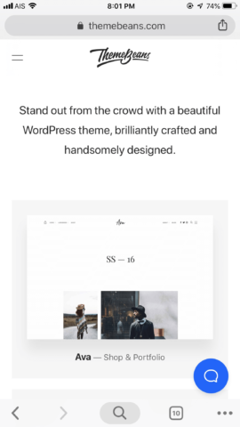
A clean and minimal look featuring the headline and top products, with easy access to the menu and support database / FAQs (ThemeBeans)
Navigation and interactivity
Navigation is a crucial element of mobile optimization, because smaller devices can significantly limit user functionality if left alone. Best practices point toward consolidating menus into the simplest and most relevant options, such as your store home or main product gallery (and/or product categories), support page, and contact page. The good news is that most themes come with a mobile menu option right out of the box!
When it comes to interactivity, factor in the differences in clickability when using different devices. Smaller buttons might be easy to click with a mouse, but they can be more difficult to tap on a smartphone, for example. Anything you can do to optimize your site’s mobile interactivity is ideal!
Many digital stores and services offer live chat support or quick and easy access to FAQs, making it as simple as possible for customers to ask questions or find out more about the products. You could install a chat support plugin, for example, or create an FAQ section or support database that is intuitively organized and searchable.
The convenience factor
It’s important to remember that many mobile users are shopping on their phones for the convenience factor alone, so simple checkout processes – especially one-click checkouts – are becoming more and more popular. This applies to other elements of your site, such as the menus, product pages, and support, too. Think about what you can do to consolidate information so that it’s concise and requires a minimal amount of clicking and browsing!
Audio and video content
When possible, it’s always preferable to host your audio and video files on third-party platforms that are already specifically optimized for mobile use. For example, Vimeo and YouTube videos can be easily embedded on your posts or pages, reducing the need for custom code or taking up hefty amounts of storage on your own server.
When it comes to audio, WordPress is perfectly fine, as it has a built-in responsive audio player, but you may also choose to use services like SoundCloud for hosting your audio files. The bonus with most audio and video platforms like these is that any plays from your website add toward your play count on the platform.
Don’t forget to test everything!
Some companies have entire departments dedicated to mobile device testing, but if you’re a smaller operation, you can use device testing services or websites (such as Responsive Design Checker or Responsinator) that allow you to preview your site on different devices.
You can also simply adjust your browser window size to see how your design responds as the dimensions change. Remember that you won’t necessarily get a perfect layout in every case; responsive design typically only focuses on 3 or 4 different resolutions, adhering to the most common and up-to-date resolution breakpoints (CSS elements that dictate how layouts appear on different screen sizes).
Most popular eCommerce themes/sites are built using popular web development frameworks such as Bootstrap 4 (used by Twitter) and are built to be “mobile first”, using a grid layout system which will scale and work on every device out of the box. This allows developers to build engaging themes without worrying about every single device being supported out the box. If you do encounter problems with certain devices, you can usually report the issue to the theme developer and they might release an update.
Getting your digital product store ready for mobile use isn’t an overnight process, but hopefully this post has given you some helpful ideas and guidelines. Mobile optimization continues to grow in necessity; fortunately, that also means there are a growing number of tools and resources available to help you achieve it!
Do you have some advice to share when it comes to optimizing your own digital product store for mobile use? What hurdles have you encountered, and how did you overcome them? What have you found most helpful? We’d love to hear what you have to say in the comments below!
Illustration by Jessica Johnston.


