Verkoop je digitale producten? Dan heb je fantastische afbeeldingen van digitale producten nodig.
🌇 Waarom? Omdat goed gemaakte afbeeldingen:
- Een goede eerste indruk maken,
- De aantrekkelijkheid van je producten verhogen,
- Vertrouwen opbouwen en dus,
- Verkopen verhogen!
In dit artikel laten we je zien hoe je geweldige afbeeldingen van digitale producten maakt. We geven je bewezen tips en bieden gratis sjablonen om je op weg te helpen.
Laten we iets moois maken! Sla over waar nodig:
- Wat zijn afbeeldingen van digitale producten?
- Waarom zijn afbeeldingen van digitale producten belangrijk?
- Tips voor het maken van goede productafbeeldingen
- Hoe je afbeeldingen uploadt en online verkoopt
- Gratis sjablonen om je werk te versnellen
Wat zijn afbeeldingen van digitale producten?

Op het risico af voor de hand liggend te klinken, zijn afbeeldingen van digitale producten afbeeldingen die demonstreren wat je product is en hoe het wordt gebruikt.
Ze verschijnen op je productpagina's op je website, of op aanbiedingspagina's op marktplaatsen. Het zijn de afbeeldingen die je producttitels en productbeschrijvingen moeten vergezellen. Ze zijn belangrijk. Heb je ooit iets op Amazon gekocht zonder de productafbeeldingen te bestuderen? Ik niet.
Wat maakt afbeeldingen van digitale producten lastig?
Eén ding dat afbeeldingen van digitale producten lastig maakt, is dat je product digitaal is. 😼 Misschien is virtueel een goed woord. Niet-fysiek? Ik weet dat het vreemd klinkt.
🔑 Het kan moeilijk zijn om te visualiseren of te demonstreren hoe een digitaal product eruitziet.
Het is heel duidelijk hoe je een productafbeelding maakt voor een fysiek product zoals een T-shirt. Je maakt productfotografie van het T-shirt of maakt een mockup van een digitaal product als het print-on-demand is.

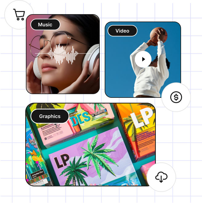
Aan de andere kant, hoe maak je een afbeelding van een digitaal product voor digitale producten die niet echt een fysiek onderdeel hebben? Enkele voorbeelden:
- Een spreadsheetformule
- Een PDF-document of e-boek
- Een WordPress-plugin, thema of stuk software dat uit bestanden op een computer bestaat
- Een HR-document sjabloon
- Een gedetailleerd gegevensrapport (wanneer de gegevensverzameling deel uitmaakt van het product, dus nog niet klaar)
Natuurlijk kun je een screenshot-afbeelding van je product in actie maken. Maar screenshots zien er vaak niet erg interessant uit, en krimpen ook niet goed in kleine 'thumbnail'-afbeeldingen.

We bespreken hieronder enkele tips om deze uitdagingen te overwinnen hieronder.
Waarom zijn afbeeldingen van digitale producten belangrijk?

Mensen zijn erg visueel ingesteld. Vooral als we aan het winkelen zijn. We kopen nooit, of zelden, iets dat we niet kunnen zien. Of in ieder geval niet in gedachten kunnen visualiseren.
Daarom moet uw online winkel, die digitale producten verkoopt (ook wel digitale downloads, downloadbare producten of virtuele producten genoemd), vol staan met afbeeldingen die potentiële klanten helpen visualiseren wat ze kopen.
Deze afbeeldingen moeten zo aantrekkelijk en uitnodigend mogelijk zijn. De webshop (website) voor digitale producten met de mooist uitziende afbeeldingen zal waarschijnlijk winnen (meer verkopen).
Sociale Media
Afbeeldingen van digitale producten zijn ook belangrijk voor sociale media. Het delen van uw producten op Facebook, Instagram, LinkedIn, Twitter, TikTok en andere platforms is vaak een geweldige manier om ruchtbaarheid te geven.
Maar dit zijn drukke en rumoerige plekken. Aantrekkelijke afbeeldingen zijn essentieel als u wilt opvallen.
Tips voor het maken van goede productafbeeldingen

U kunt veel tijd besteden aan het nadenken en overdenken van uw digitale productafbeeldingen. Onze tips zijn nuttig voor iedereen, maar vooral nuttig als u een drukke eigenaar van een klein bedrijf bent en SNEL doe-het-zelf resultaten nodig heeft.
Houd er ook rekening mee dat de fotografie en grafische vormgeving die nodig zijn voor het maken van goede productafbeeldingen vroeger speciale professionals vereisten (en het is vaak een goed idee om hen in te huren). Tegenwoordig is het echter mogelijk om met internetgebaseerde ontwerptools zelf afbeeldingen van hoge kwaliteit te maken. Dat is wat we u hier vandaag zullen laten zien.
Dit artikel is geen diepgaande stap-voor-stap handleiding voor professionele ontwerptools zoals Adobe Photoshop en Illustrator of Affinity Photo en Designer. We hebben echter ook enkele sjablonen voor gebruik in die programma's hieronder!
Hier zijn onze vier belangrijkste tips voor het maken van productafbeeldingen van hoge kwaliteit:
- Maak ze opvallend
- Maak afbeeldingen van hoge kwaliteit
- Formatteer afbeeldingen voor veelzijdigheid
- Optimaliseer afbeeldingen voor het web
Maak ze opvallend
U wilt dat uw afbeeldingen opvallen en er mooi uitzien. Hier zijn enkele bewezen en gemakkelijke manieren om dat te bereiken.
Kleuren
Kleuren laten afbeeldingen van de pagina springen. Ze trekken de aandacht. Kleuren kunnen de kijker verrukken. Wanneer ze met herhaling en consistentie worden gebruikt, bouwen ze een consistent merk op dat vertrouwen wekt en uw klanten (en potentiële klanten) helpt u te herkennen.
Gebruik geen zwart-wit of volledig grijs, tenzij u daar een reden voor heeft. Niet tenzij u een bepaalde uitstraling nastreeft.

Kleuren kunnen veel dingen communiceren. Ik heb er bijvoorbeeld voor gekozen om met deze screenshot voor een spreadsheet-sjabloon een vergelijkbaar groen te gebruiken dat zowel Google Sheets als Microsoft Excel in hun branding gebruiken. (Opmerking: Het is geen toeval dat Google Excel volgde in groene branding voor spreadsheets, en blauwe branding voor documenten zoals Microsoft Word gebruikt!)

Contrast
Contrast is het verschil tussen elementen in uw ontwerp of productfoto. Het verschil tussen lichte en donkere gebieden. Of verschillen in kleuren.
Net als kleur trekt contrast de aandacht en maakt het een afbeelding aantrekkelijk, zelfs verrukkelijk. Het gebruik van kleuren die (contrast) van elkaar afsteken, helpt u een stemming of sfeer te communiceren.
Zorg er ook voor dat uw achtergrondkleur en letterkleur voldoende contrasteren voor gemakkelijk lezen. Houd rekening met mensen met visuele beperkingen, zoals kleurenblindheid. De AIM Color Contrast Checker helpt daarbij. Hiermee kunt u kleuren uitproberen met een drag-interface om te zien welke kleurenschema's voldoende contrast hebben.

- Doe ideeën op voor kleurenparen op Adobe Color
- Zorg ervoor dat uw kleuren voldoende contrast hebben om zichtbaar te zijn voor mensen met visuele beperkingen op de AIM Color Contrast Checker
Lettertypen
Het gebruik van verschillende lettertypen in een ontwerp kan aantrekkingskracht en opwinding toevoegen. Als u alleen Arial of Times New Roman in uw ontwerp gebruikt, ziet het er saai en onprofessioneel uit.
Sommige lettertypen zijn gemaakt voor hoofdtekst. Deze lettertypen zijn strak en gemakkelijk te lezen. Dat is goed als u veel tekst leest. Hoofdtekst is waar u 'minder spannende' lettertypen zoals Arial gebruikt.
Andere lettertypen zijn voor koppen en subkoppen. Deze lettertypen kunnen leuk zijn. Ze trekken de aandacht naar zichzelf toe. Sommige lettertypen communiceren een stijl of tijdperk. Ze zijn goed voor social media banners of koppen, omdat ze opvallen. Maar u wilt geen vijf lange alinea's in een koplettertype lezen.
De truc is om verschillende lettertypen in een ontwerp te combineren. Typografie is een complete academische discipline. Het kan jaren duren om de subtiele verschillen in lettertypen te leren en te benutten.
Voor vandaag zijn hier twee manieren om goede lettertypecombinaties te krijgen.
- Zoek lettertype-sites – U kunt verschillende lettertypen uitproberen op sites zoals https://fonts.google.com/ of https://fonts.adobe.com/fonts.
- Dit kan tijdrovend zijn, en
- U moet er rekening mee houden dat u voor veel lettertypen moet betalen
- Gebruik sjablonen – U kunt al doende leren en snelle resultaten behalen met sjablonen. Er zijn talloze gratis sjablonen beschikbaar met online ontwerptools zoals Canva, VistaCreate en Adobe Creative Cloud Express (CCE).

We raden aan om te beginnen met sjablonen om goede lettertypecombinaties in actie te zien. Kijk eens naar alle lettertype-pret die u kunt ontdekken op Canva (hierboven). Probeer dingen uit. Leer al doende.
💙 Houdt u van lettertypen? Dan moet u uw eigen lettertypen maken en verkopen! Leer hoe en bekijk wat voor coole dingen andere EDD-klanten doen met lettertypen.
Maak gebruik van goede composities en lay-outs
Men zou kunnen stellen dat het begrijpen en gebruiken ervan een universitaire graad en jarenlange ervaring vereist. Dat is in sommige opzichten misschien waar. Maar dat betekent niet dat u niet kunt beginnen met het gebruik van deze bewezen compositietips.
Regel van derden
De regel van derden is een lang gebruikte richtlijn voor het maken van opvallende beelden. U verdeelt een afbeelding in 9 vierkanten. U plaatst belangrijke elementen van uw foto of ontwerp langs deze lijnen, dicht bij deze lijnen, of waar twee lijnen samenkomen.
Dit document sjabloon productafbeelding is bijvoorbeeld aantrekkelijker omdat het document niet in het midden staat.

Hoeken zijn vaak interessant
Door uw afbeeldingen of tekstkoppen een beetje te draaien, geeft u uw productafbeeldingen of ontwerpen wat energie en opwinding.
Met deze eBook-productafbeelding voegt de lichte hoek bijvoorbeeld wat mooie flair toe.

Gebruik fysieke producten als context
Soms is het oké om beelden en context te lenen uit de wereld van fysieke producten voor uw digitale producten. Mensen zullen uw idee begrijpen.
Help mensen uw digitale product te visualiseren door het in de context te plaatsen waarin het zal worden gebruikt.
U kunt bijvoorbeeld een spreadsheetproduct op een mooi nieuw laptopscherm in een kantooromgeving tonen. Mensen zullen begrijpen dat ze niet de laptop of de conferentietafel kopen, maar alleen uw spreadsheet uit de context van uw website.
Of, een ander voorbeeld, u kunt een eBook tonen dat wordt gelezen op een eReader-apparaat of iPad. Potentiële klanten begrijpen dat ze alleen het eBook kopen.
Nog een laatste voorbeeld: er is een grote trend om schaduwen van boomtakken toe te voegen aan afdrukbare documenttemplates en vergelijkbare soorten producten. Dit is visueel aantrekkelijk en stelt de potentiële klant in staat zich voor te stellen dat hun afdrukbare document op hun tafel in de tropische bries ligt, zelfs als het winter is waar ze zijn, het voelt fijn.

Maak afbeeldingen van hoge kwaliteit
Tot op zekere hoogte is wat een afbeelding van hoge kwaliteit maakt subjectief. De ene persoon vindt een ontwerp (of productafbeelding) zo eenvoudig dat iedereen het had kunnen maken, terwijl een andere persoon dezelfde afbeelding geweldig vindt vanwege de eenvoud.
We richten ons op een paar dingen die u kunt doen om uw afbeelding technisch gezien van hoge kwaliteit te maken.
Zorg ervoor dat uw afbeeldingsgroottes zijn:
- Hoge resolutie
- Niet te klein
- Scherp (indien fotografie betrokken is)
Hoge resolutie
Veel beeldschermen en monitoren zijn tegenwoordig veel dichter gepixeld dan een paar jaar geleden. Zorg ervoor dat u uw afbeeldingen groot maakt, zodat ze correct kunnen worden weergegeven op high-DPI beeldschermen en monitoren.
Het is tegenwoordig normaal dat schermen 225 pixels per inch hebben. Een paar jaar geleden was 95 PPI gebruikelijker.
- PPI – Pixels per inch
- DPI – Dots per inch
- Retina – Apple's term voor schermen met een hoge PPI. Elke iPhone, iPad of Mac die de afgelopen 7-10 jaar is gemaakt, heeft 225-260 PPI. U wilt dat uw afbeeldingen er goed uitzien op deze schermen.
🔑 De beste methode hiervoor is om uw afbeeldingen twee keer zo groot te maken als u wilt dat ze worden weergegeven.
Bijvoorbeeld:
- Wilt u dat uw productafbeelding wordt weergegeven op 600×600 pixels?
- Ontwerp en exporteer uw afbeelding op 1200×1200 pixels.
Op high-PPI en Retina-schermen zorgt het hogere aantal pixels ervoor dat de afbeelding er scherp uitziet. Op de oudere 95 PPI-schermen zullen de extra pixels simpelweg niet zichtbaar zijn. Niets verloren.
Niet te klein
Vanwege de hoge resolutie van moderne schermen moet u groot beginnen met pixelgebaseerde afbeeldingen. U kunt ze later altijd verkleinen voor weergave op het web.
U kunt een pixelgebaseerde afbeelding niet groter maken, deze wordt wazig en vlekkerig.
Als u vectorgebaseerde afbeeldingen gebruikt, kunt u deze groter maken.
Pixels: de kleine puntjes waaruit een foto of ontwerp bestaat. Je kunt pixelgebaseerde afbeeldingen niet schalen (groter maken), maar wel kleiner. Pixelbestandsformaten zijn onder andere JPG, PNG, GIF.
Vector: kunstwerk opgebouwd uit geometrische lijnen. Je KUNT vectorafbeeldingen schalen en ze zien er scherp uit. Vectorbestandsformaten zijn onder andere: SVG, AI, EPS.
- Als je pixelgebaseerde afbeeldingen gebruikt, begin dan altijd met een grotere afbeelding. Deze moet minstens twee keer zo groot zijn als je wilt weergeven voor schermen met een hoge PPI / Retina.
- Je weet nooit welke verschillende formaten je nodig hebt voor social media, dus zorg ervoor dat je nooit begint met een bestand dat te klein is. Begin groot, verklein het daarna.
Scherp
Als je foto's maakt, zorg er dan voor dat het product scherp is. Dit is vrij basaal, maar ook belangrijk en moet vermeld worden. Als je een mobiele telefoon gebruikt, hebben de meeste autofocus-tools die je gemakkelijk kunt leren en gebruiken.
📸 Snelle tip:
Houd je telefoon of camera met twee handen vast, met een van je armen tegen je lichaam om stabiliteit te garanderen. Hoe stabieler je camera, hoe scherper en meer gefocust je beelden zullen zijn. Een schokkerige foto is waarschijnlijk wazig.
Formateer afbeeldingen voor veelzijdigheid
Er zijn zoveel mogelijke formaten en afmetingen om je productafbeeldingen te maken. Elk social media kanaal heeft verschillende formaten en nuances. Waar begin je?
We raden aan om te beginnen met één veelzijdig formaat en dit vervolgens aan te passen indien/wanneer nodig.
Het veelzijdige formaat dat we aanbevelen is 2:1. Een breedbeeldformaat dat twee eenheden breed en één eenheid hoog is. We gebruiken het veel op de EDD website.
- Ga uit van 2000px bij 1000px als je masterdocument,
- Exporteer vervolgens naar 1200px bij 600px

Dit formaat werkt redelijk goed op alle kanalen. Pas vervolgens meer formaten aan indien nodig.
Optimaliseer ze voor het web
Het optimaliseren van afbeeldingen voor het web omvat twee verschillende taken.
- Het gebruik van het juiste afbeeldingsformaat voor gebruik op internet
- Het comprimeren van de afbeelding
Het juiste formaat gebruiken
Er zijn vier belangrijke afbeeldingsformaten die je op het web zult gebruiken.
- PNG – Portable Network Graphics – Gebruik deze voor alles behalve foto's of animaties (zoals logo's of illustraties)
- JPG – Joint Photographic Expert Group – Gebruik deze voor foto's
- GIF – Graphic Interchange Format – Deze worden gebruikt voor geanimeerde GIF-afbeeldingen (zoals leuke memes). Gebruik ze voor animaties, maar PNG's of JPG's zijn het beste voor de meeste statische afbeeldingen.
- WebP – Web Picture Format – Een nieuwer bestandsformaat voor webafbeeldingen dat kleiner is dan PNG's of JPEG's. Veel apps (zoals Adobe en Affinity) ondersteunen dit formaat nog niet volledig. Voorlopig raden we aan het niet te gebruiken. We zullen dit artikel bijwerken naarmate het gebruikelijker wordt.
Het comprimeren van de afbeelding
Je wilt je digitale productafbeeldingsbestanden zo klein mogelijk maken, terwijl ze er nog steeds goed uitzien. Dit wordt beeldcompressie genoemd.
Dit is een heel technisch expertisegebied op zich. We raden aan om gewoon een websitedienst te gebruiken om uw afbeeldingen te comprimeren. Op dit soort websites uploadt u uw originele afbeelding, zij comprimeren deze en bieden u een nieuw bestand aan om te downloaden.
Hier zijn er twee die we aanbevelen:
Gebruik de gecomprimeerde afbeeldingen die u van een van deze websites krijgt als de bestanden die u op uw website uploadt. Kleine bestanden zorgen ervoor dat uw website sneller draait voor potentiële klanten. Dat is belangrijk. Als ze lang moeten wachten om uw productpagina's te zien, zullen ze waarschijnlijk geïrriteerd raken en vertrekken.
Gebruik Alternatieve Tekst (Afbeeldingsbeschrijvingen)
Zorg ervoor dat u uw afbeeldingen beschrijvingen geeft. Dit helpt bij toegankelijkheid (a11y) en zoekmachineoptimalisatie (SEO).
- Alt-tekst – Korte versie van Alternatieve Tekst
- Alt-tags – Een ander woord voor Alt-tekst
- Alternatieve Tekst – De tekstbeschrijving die u aan een afbeelding toevoegt voor schermlezers
Voor toegankelijkheid stellen alt-tags/afbeeldingsbeschrijvingen mensen met visuele beperkingen of een handicap in staat te weten wat de afbeelding is. Dit gebeurt met schermlezers. Schermleessoftware gebruikt de alt-tekst om de afbeelding met geluid/gesproken woord te beschrijven.
Voor SEO kunnen de afbeeldingsbeschrijvingen zoekmachines helpen begrijpen waar uw inhoud over gaat. Het is ook een kwaliteitsmaatstaf die Google Zoeken op uw site controleert.
😇 Voeg afbeeldingsbeschrijvingen toe omdat het het juiste om te doen is. Het maakt het web toegankelijker en inclusiever. Maar u profiteert ook van SEO.
In de oude dagen van het web moest u handmatig afbeeldingsbeschrijvingen toevoegen als alt-tekst in de HTML. Leer hier meer.
Nu hebben moderne websitebouwers, zoals WordPress, een visuele interface om ze toe te voegen. Hier zijn de twee belangrijkste manieren om dit op een WordPress-site te doen.
De eerste is in het tabblad Media. Ga op uw WordPress-dashboard naar Media in het menu aan de linkerkant. Klik op een afbeelding om het paneel Bijlagegegevens te laden. Daar ziet u linksboven het veld Alternatieve Tekst. Voer daar een afbeeldingsbeschrijving in.
 – Easy Digital Downloads")
De tweede is binnen de post-editor. Wanneer u een pagina of bericht op WordPress schrijft, kunt u een Afbeelding-blok invoegen. Klik op een afbeeldingsblok en in het menu aan de rechterkant is er een vak genaamd Alt Tekst (Alternatieve Tekst). U kunt daar ook een afbeeldingsbeschrijving invoeren.
Hoe afbeeldingen te uploaden en online te verkopen

- ✅ U heeft een digitaal product of producten gemaakt
- ✅ U werkt aan een aantal geweldige productafbeeldingen
- 🔲 Weet u al hoe u uw digitale producten gaat verkopen?
Wij kunnen u daarbij helpen! We laten u zien hoe u kunt verkopen en hoe u uw productafbeeldingen kunt uploaden.
De beste manier om uw digitale producten te verkopen is met WordPress en Easy Digital Downloads (EDD).

Waarom WordPress?
WordPress is de beste websitebouwer ter wereld. Het drijft meer dan 43% van het internet aan. Geen enkele andere websitebouwer/platform heeft 5% bereikt.
Je kunt erop vertrouwen als je eCommerce-platform en meer. Wat je over een paar jaar ook nodig hebt, je kunt erop vertrouwen dat een WordPress-site het aankan. Dat kun je niet altijd veilig zeggen over andere platforms.
WordPress heeft het grootste ecosysteem van plugins, thema's en professionele dienstverleners. Het is de juiste mix van krachtig, betaalbaar en toekomstbestendig.
🤷🏾 Heb je nog geen WordPress-site? Je hebt alleen een goede webhost nodig om dit gratis open-source powerhouse te draaien. Klik hier voor hulp bij het kiezen van een host (er zijn ook kortingscodes!).
Waarom EDD?
EDD wordt vertrouwd door meer dan 50.000 eCommerce-bedrijven. Het is een van de meest vertrouwde WordPress-plugins die beschikbaar zijn.
EDD is speciaal gebouwd voor het verkopen van digitale producten. De meeste andere oplossingen zijn dat niet.
Easy Digital Downloads is een krachtige manier om een complete eCommerce-website te bouwen zonder code! EDD heeft een gratis versie voor altijd en kan met je meegroeien als je in de toekomst meer nodig hebt (met EDD Passes).
Waarom niet andere oplossingen?
Omdat de meeste andere eCommerce-oplossingen niet gebouwd zijn voor digitale producten. Ze kunnen wel digitale producten 'doen', maar het is vaak een bijzaak. Soms is het verkopen van digitale producten erop een onbetrouwbare toevoeging.
👎🏾 Andere eCommerce SaaS'en of Platforms
Veel van de populairste platforms, zoals degene die rijmt op Shopify, zijn gebouwd voor het verkopen van fysieke producten. Ze hebben allerlei tools en opzetprocessen voor verzending, voorraad en logistiek die je nodig hebt voor fysieke goederen, maar die je als digitale maker niet nodig hebt. Dat kan tijdverspilling zijn.
Veel platforms hebben dure maandelijkse kosten en misschien een paar dagen gratis proefperiode. EDD heeft een gratis versie voor altijd. EDD laat je beginnen en draaien zonder overheadkosten.
👎 Marktplaatsen
De marktplaatsen, zoals Etsy of Creative Market, zijn makkelijk om op te starten. Maar ze rekenen, naar verluidt onnodige, tussenpersonen kosten in veel gevallen. Ze nemen een deel van je omzet. Hoe meer je verdient, hoe meer ze nemen.
Je kunt meteen beginnen met het verkopen van je digitale producten. Gratis! Wat houdt je tegen?
Pak EDD vandaag nog en ga aan de slag!
Met één gratis download krijg je:
- Volledige controle over de prijzen
- Beveiligde productbestanden, alleen betalende klanten hebben toegang tot je digitale downloads
- Controle over de klantervaring en branding (white label)
- Winkelwagen met betaalmogelijkheden
- Flexibele afrekenopties
- eCommerce-rapporten
- Klantbeheer (basale CRM)
- Kortingscodes
- Stripe en/of PayPal betaal gateway integratie
- Gebruik Stripe en/of Paypal voor het accepteren van creditcards
- Gebruik Stripe voor Apple Pay en Google Pay
Begin nu met slechts een paar klikken! 👇🏽
Je productafbeeldingen uploaden
Wanneer je EDD hebt geïnstalleerd op je WordPress-site, heb je een nieuwe tab aan de linkerkant van je WordPress-dashboard met de naam Downloads.

Als je nog nooit een WordPress-plugin hebt geïnstalleerd, klik dan hier om alles over plugins te leren.
De digitale producten die je met EDD op je website verkoopt, worden ‘Downloads’ genoemd.
Om een nieuwe te maken:
- Klik op Nieuwe toevoegen
- Voeg een naam en productbeschrijving toe
- Stel een prijs in
- Koppel de downloadbare productbestanden, en
- Upload een afbeelding onder Downloadafbeelding
- Klik op Publiceren om het zichtbaar te maken op de voorkant van uw website
Voeg uw afbeelding toe in het Downloadafbeelding vak aan de rechterkant.

🔎 Voor meer gedetailleerde instructies over het maken van een download en het gereedmaken voor verkoop, bekijk deze snelstartgids.
Onthoud dat u, voordat u uw afbeeldingen uploadt, ze moet optimaliseren voor het web. Ik raad TinyPNG aan. Hoewel ik professionele grafische software gebruik, gebruik ik deze site elke dag omdat ik erg tevreden ben met de kwaliteit van de afbeeldingen en kleine bestandsgroottes. De website maakt geoptimaliseerde PNG- en JPEG-bestanden (ondanks de naam).
Gratis sjablonen om uw werk te starten

Hier zijn enkele sjablonen om u op weg te helpen. Om deze te gebruiken heeft u een gratis Canva-account, een Adobe Photoshop- of Creative Cloud-licentie, of een exemplaar van Affinity Designer of Photo nodig.

Laptop Schermopname Sjablonen

Tablet Schermopname Sjablonen

eBook Sjablonen

Spreadsheet Sjablonen

Document Sjablonen
Gratis Stockafbeeldingen
Er zijn een paar geweldige websites met gratis stockfoto's en vectorafbeeldingen die we wilden delen:
- Unsplash – Een geweldige site met gratis stockfoto's, inclusief texturen die gebruikt kunnen worden als achtergrondafbeelding.
- Pexels – Nog een site met gratis stockfoto's en video's
- Streamline – Een verzameling van enkele van de beste vectorpictogrammen, illustraties en emoji's op het web. Ze hebben gratis en betaalde collecties.
Conclusie
Goed gedaan! U hebt geleerd hoe u fantastische digitale productafbeeldingen maakt. Hopelijk helpt een van onze sjablonen u om met volle snelheid vooruit te gaan.
Productafbeeldingen zijn erg belangrijk. Het zal altijd de extra moeite waard zijn om ze er mooi uit te laten zien. We vertrouwen erop dat ze u zullen helpen slagen met uw online kleine bedrijf en dat begeerde passieve inkomen zullen genereren.
We hebben veel meer bronnen voor digitale makers zoals jij. Waar wil je hierna meer over leren?
- 🤩 Eenvoudige manieren om uw digitale downloadwinkel er geweldig uit te laten zien
- 🧲 Maak Lead Magnets om uw e-maillijst te laten groeien
- Verkoopgidsen:
Zorg ervoor dat u zich abonneert op onze nieuwsbrief of volg ons op Facebook en Twitter om onze nieuwste bronnen voor digitale makers te ontvangen.