The
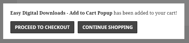
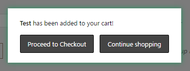
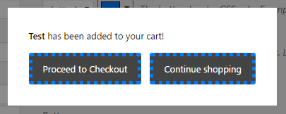
Add To Cart Popup extension adds a popup functionality to Easy Digital Downloads. When activated, after a customer clicks an ‘Add To Cart’ button, a small modal popup appears and gives them the option to go directly to the checkout page or to continue shopping. Here’s an example using the default styling of the TwentyFifteen theme.
 Here’s how to configure the popup.
Configuration Instructions for Add to Cart Popup
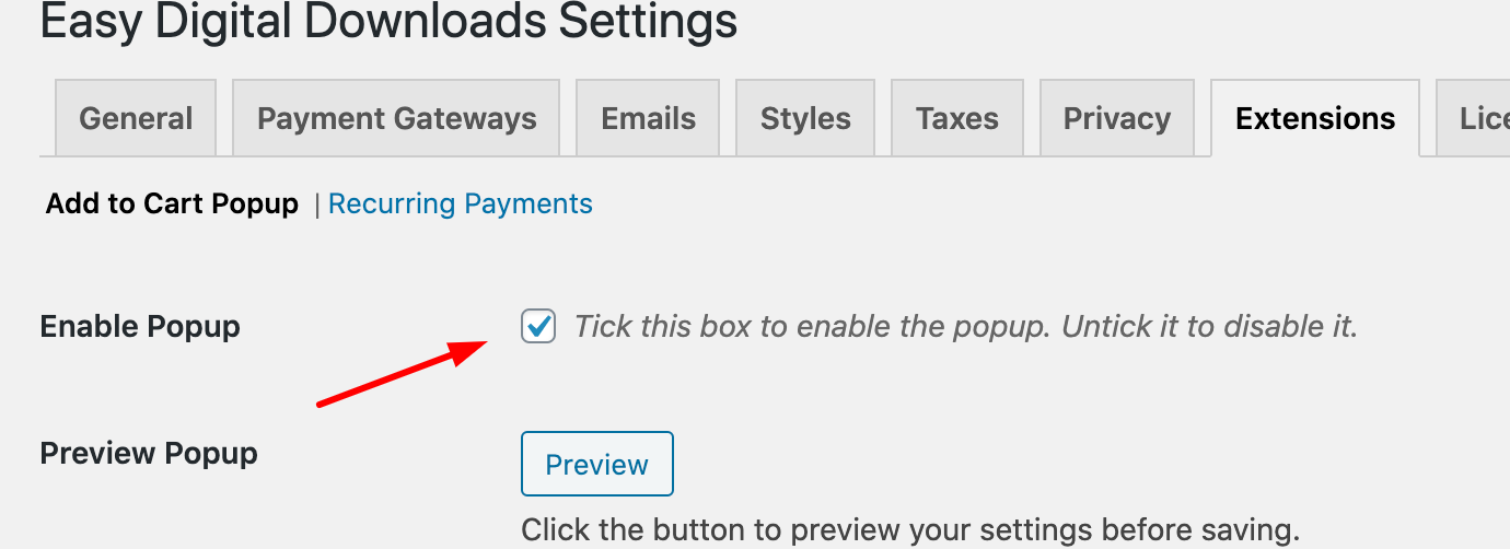
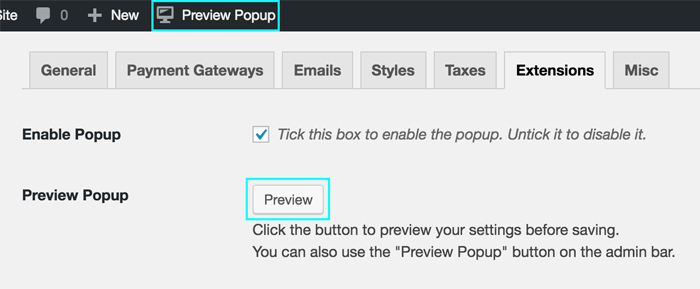
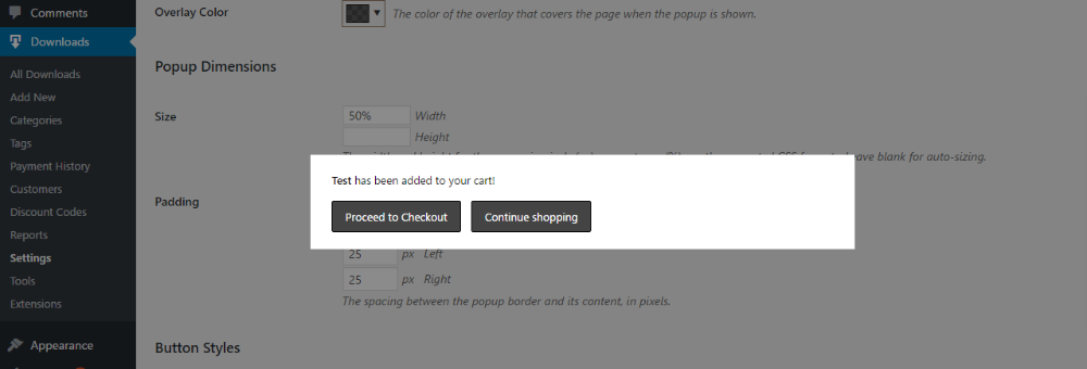
- Once installed, locate the settings for this extension via WordPress admin → Downloads → Settings → Extensions → Add To Cart Popup
- When you activate the plugin, the popup will be disabled by default. This is so you have the chance to adjust settings before activating it on your site. The popup can then be enabled by ticking the Enable Popup checkbox.
Note: When using the “Buy Now” button feature, or the Free Downloads extension, the popup will be automatically disabled so as not to interfere with payment gateway redirections or third party popups.
Customization
General Appearance
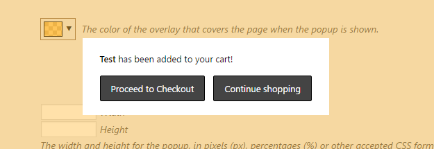
Preview Popup: This button allows you to trigger a popup while on the settings page to view your changes before you save them. You can also use the “Preview Popup” link on the Admin Bar. We added this so that you won’t have to constantly scroll back to the top of the settings page to preview the popup.
Note that the preview might not be entirely accurate when using shortcodes since some styles might not be loaded on the WordPress Admin. It is recommended to preview on your site’s front-end when you’re done to confirm the popup’s appearance.
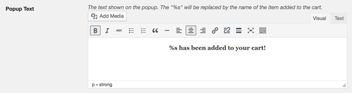
Popup Text: Here you can set the text shown on the popup. If the plugin detects “%s” (without quotes) anywhere in this option’s text, it will be changed into the name of the download that the user has added to their cart. You also have the option of adding media files (such as images), embeds and even shortcodes within the popup.
Popup Plural Text: Similar to Popup Text, this text is shown on the popup when multiple items have been added to the cart at the same time. This is typical when using variable pricing options that allow multiple options to be added simultaneously. Once again, you also have the option of adding media files (such as images), embeds and even shortcodes within the popup.
Remember that you can expand the editor’s toolbar by clicking the right-most button on the editor!
Font Size: This allows you to change the overall size of the font used in the popup. Various CSS formats are accepted here.
- Pixel sizes are absolute fixed sizes. Example: 12px
- Percentage sizes are relative to the theme’s default font size. Example: 120% (20% larger than the theme’s font size).
- “em” values are similar to percentages, where 1em is the default font size. Example: 2em (twice as large as the default).
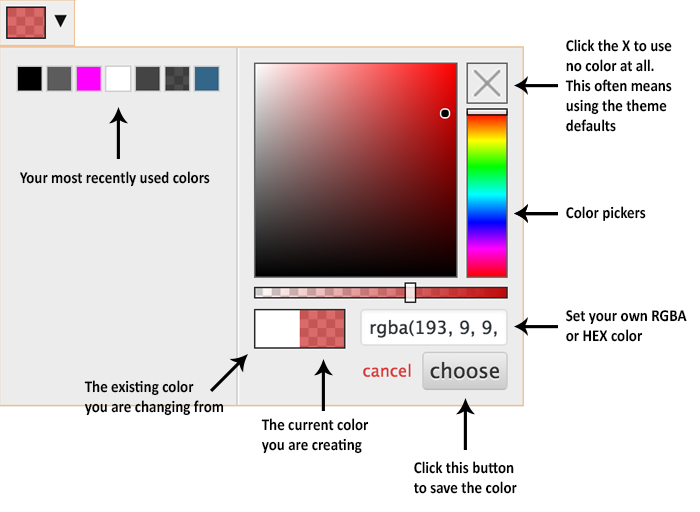
Text Color: The color of the popup text. To set the color, click on the color box to reveal the color picker.
Background Color: The color of the popup’s background. To set the color, click on the color box to reveal the color picker.
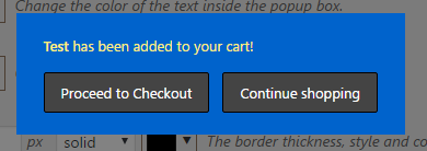
Here’s an example with the text color set to yellow and the background color set to blue:
Border: This option lets you style the border of the popup, which appears around the edge of the popup box. The three options are the width (or thickness), the style and the color, respectively.
Border Radius: The radius of the border’s corners. The larger this value, the more rounded the corners will be. This also applies if you have set the border as not visible (width is zero, style is “none” or color is transparent).
Shadow: This option lets you add a shadow to the popup by setting the shadow amount (size and thickness) and the shadow color. The example below adds a dark green shadow with a shadow amount of 15:
Overlay Color: The term overlay refers to the color that covers the rest of page when the popup is shown. You can change its color by clicking the color box to reveal the color picker, which also includes a transparency option. The example below changes the overlay to a light semi-transparent orange:
Popup Dimensions
Size: Here you can control the size of the popup. Various CSS formats are accepted here, including pixels and percentages.
- Pixel sizes are fixed sizes. Example: 500px (500 pixels on the user’s screen)
- Percentage sizes are relative to the size of the user’s browser window. Example: 60% (60% of the user’s screen)
If the width or height are left blank, the popup will automatically calculate them to fit the content.
The following example demonstrates a popup with a width set to 500px and the height left blank to be automatically calculated.
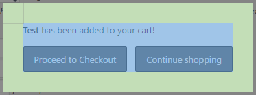
Padding: The padding refers to the spacing between the edge of the popup and its content, as shown in the following image:
The area in green is what is referred to as the “padding”.
Button Styles
Button Border: The border for the buttons shown in the popup, similar to the previous Border option. You can set the thickness, style and the color of the border respectively.
Corner Radius: The radius of the button corners. The larger this value, the more rounded the corners will be. This also applies if the button border is not visible (width set to 0, style is “none” or color is transparent).
For example: a blue “dotted” border with a width of 5px and a corner radius of 3px:
Button Padding: Similar to the popup Padding option, this allows you to adjust the spacing inside the button. For example, the following uses 6px top and bottom padding and 30px left and right padding.
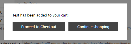
Button Direction: You can set the buttons to either show side-by-side horizontally, or to stack up on top of each other vertically. The default setting is horizontal.
Button Alignment: You can choose between left, center and right alignment. Choosing either left or right will push the buttons to that respective side while choosing center will position the buttons in the center of the popup.
Button Order: This option allows you to choose which button is displayed first. If the Button Direction is set to horizontal, then this option will determine which button is shown to the left. If the Button Direction is set to vertical, then this option will determine which button is shown on top.
Checkout/Continue Button
The next two sections consist of identical options that allow you to tweak the individual appearance of both buttons.
Enabled: Choose whether to show or hide the button.
Text: You can customize the text of each button to whatever you want.
Text Color: The color of the text inside the button.
Text Color on Hover: The color of the text inside the button when the mouse cursor is hovering over the button.
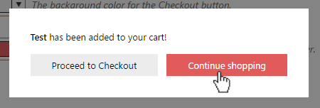
Background Color: The background color of the button.
Background Color on Hover: The background color of the button when the mouse cursor is hovering over the button.
The following example uses white buttons with black text that change into red buttons with white text when the mouse cursor is over the button.
The Color Picker, Explained