You’ve conceptualized your digital product store and you’re ready to start selling your products – now what?
We’ve discussed how to start your digital product store, from domains and hosting to eCommerce platforms and payment processing; now it’s time to organize your products and content into a cohesive website that enables your customers to get to know your brand, and easily browse and make purchases.
Having an attractive, efficient website layout and an up-to-date, streamlined purchase process is essential if you want to get your store up and running – and see some results from all of your hard work! So, let’s take a look at the most important elements you need to bring your store to life.
Product pages
Since your website is based entirely around selling your products, we’ll start here! Your product pages are the backbone of your website – where you will showcase your products in their full glory, and the product page is also the place where your customers will likely make a purchase decision.
To create customer confidence and convert sales, you want to present your brand and products in a professional manner, which means giving your website (and product pages) a sense of quality, continuity, and legitimacy. Here are a few tips to achieve these goals:
- Develop a template. Your product pages should all follow a similar page layout, with all copy written using the same language and tone.
- Create a stellar product description. You want to be as accurate and thorough as possible while also delivering a concise and easily readable description of everything your product has to offer.
- Highlight key features with callouts. Your customers want to be able to assess your products as quickly as possible, and you can communicate a lot with just a few phrases! Consider listing your product’s “standout” features in callout fashion.
- Provide relevant metadata. Transparency is crucial for customer confidence, so including things like any software prerequisites, file types, file size, and other metadata ensures that you are accurately advertising your products.
- Showcase artwork and product demos. Take advantage of eye-catching artwork (such as eBook covers, product logos, or promotional graphics) by displaying it front and center (figuratively speaking). Also make sure your product demos (such as .MP3 previews, screenshots, sample chapters) are clearly visible and accessible, making it as easy and efficient as possible for customers to gauge the full scope of your products.
- Include testimonials. If you have any product testimonials, be sure to include them. If you don’t, consider giving away a promotional copy or two in exchange for a review or testimonial.
- Use video where possible. Videos can be extremely useful for explaining product features or giving product walkthroughs (especially for products like software and web apps), and you can use them to consolidate all of the information on your product page into one easy-to-consume format.
- Tag and categorize your products. This makes it convenient for customers to find related products, and also keeps your products organized and easily searchable by category. Product tags also contribute to SEO, enabling people to find them more efficiently in search results.
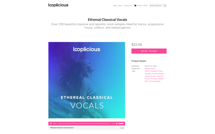
- Make it simple to purchase. Your product price (and any relevant tax) should be clear and visible, with no guesswork left to the customer; you want to make it as easy as possible for them to buy your product. If you want to offer product variations within the same product page, make sure the options are easy to select, deselect, and change.
Some questions you might want to ask yourself when designing and organizing your product pages are:
- Is all relevant information included and upfront?
- Is the page readable or overwhelming?
- Are product demos and artwork visible and easily accessible?
- Is the layout confusing?
- Is it easy to navigate to other pages?
- Is it easy to purchase?
Homepage
This is where your customer can get an overview of your store, so you want your homepage to be eye-catching and inviting. Most digital product stores will use the homepage as a snapshot of the store, highlighting top products, new features, and special offers – as well as the default place to go in order to browse the site’s entire product collection.
There are a variety of options available for page layouts when it comes to your homepage, so think about the type of product you’re offering and how to most effectively display it. Some stores opt for a slideshow header, showing off their latest additions, discounts, or testimonials. Others get straight to the point by highlighting key features and giving a call-to-action, or simply featuring a search bar along with a gallery of products.
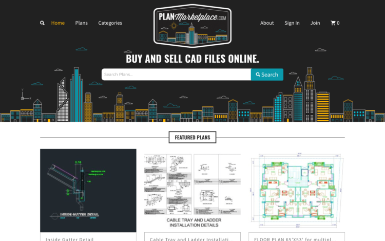
Whatever homepage style you choose, remember that this is where you are saying to your customers, “This is what we sell, and what we’re all about,” so present your brand and products in a way that communicates your goals, quality, and style to them while enabling them to envision using your product to meet their own needs.
Pricing
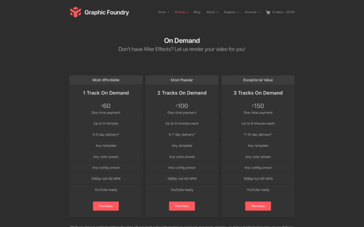
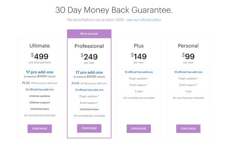
If you have a pricing structure that is based on a membership / subscription model, you’ll want to have a dedicated page where your customers can go to see their options. As a general rule, offering three pricing tiers is intuitive, as it covers three fundamental levels of membership: basic, standard, and pro (or however you want to name them). List all features, highlighting any key differences in your membership tiers (such as different numbers of downloads included, priority support, etc.), so that customers can easily compare – just don’t overwhelm them with so many options that they can’t choose!
Regardless of the number of tiers you end up with, you ultimately want to remove as many decision-making barriers as possible for your customers if you want to maximize sales. You can drive sales toward higher-priced memberships by highlighting your mid-level tier – a proven strategy for increasing revenue for membership sites.
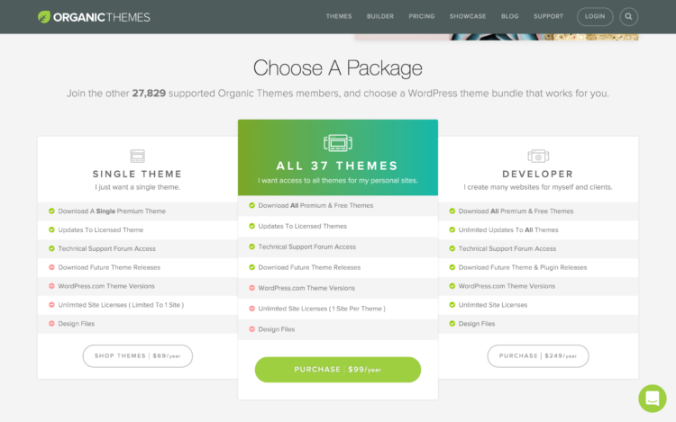
Some digital product stores have specific pages for bundles and multi-buy offers, giving deal seekers a single place to go to find what they’re looking for. You might also decide to have an “all access pass” or download credit system, in which case you can offer different pricing tiers for different packages. If your main focus is per-product prices, you can always create a pricing page that categorizes your products by price group, such as “standard” or “premium”.
If you offer a money back guarantee, make sure it’s clearly displayed on your pricing page, as well as a link to your refund policy (we will get to this later). Seeing everything at once – pricing options and any terms and consumer protections in place – makes customers feel more secure and motivated to buy from you.
Checkout page
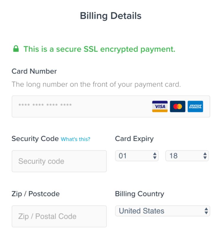
Where the magic happens! Because you’re selling a digital product, you have a distinct advantage over a physical product store: checkout is a breeze. In many instances of digital product sales, customers won’t need to input information that is irrelevant for an emailed or downloaded file. Name, email address, and payment details may be all you need! This gets your customer to the product faster; reducing friction and time spent on the page, creating a quick conversion for you and a painless experience for your customer.
Optimize your checkout for a speedy process and you’ll also help to reduce cart abandonment. Bounce rates are typically high on the checkout page of most websites, with customers exiting your site because they weren’t 100% sure about their purchase. Remember, the aim is a streamlined purchase process!
Additional elements can help increase your conversions: consider implementing trust marks and logos of well-known payment gateways to put your customers at ease. When they’re handing over their private credit card details, they want to be assured that their data is safe and encrypted. Additionally, remember that having an SSL certificate is required in order to use payment gateways like Stripe and PayPal, and it helps to build trust in your site as a safe place to shop.
About page
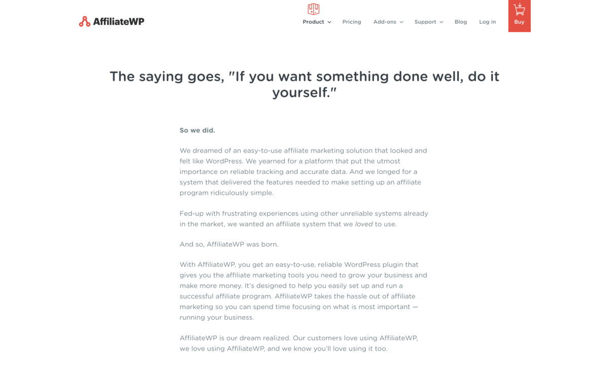
In the modern era – especially if you’re selling digital products – transparency is huge! You want to show your customers that you’re a trusted source for the products they’re looking for, and give them a personal experience by including a little bit of background information about yourself and your business on your About page.
Share your story; connect with your customers by telling them about your expertise, and why you created your digital product store. Show them that you’re human (if you are :-D), and that you’re here to provide a solution to their needs. What was the problem in your industry that inspired you to start creating digital products? What purpose do they serve? When was your company founded? What is your mission statement? What are your goals for the future?
You might decide to write an entire founding story, describing the process, obstacles, and successes along the way. You could include photos and brief introductions of your team, as well as the use-case scenarios that your products were designed to fulfill. All of these things make for a compelling About page that gets customers intrigued about you, your company, and your products – and an educated customer is more likely to buy.
Support
Customer support can make or break any business, and when it comes to selling digital products, having a clear and complete Support page is essential to keep things running smoothly. Think about it: digital product stores typically don’t have physical offices, so how are your customers supposed to contact you with questions and concerns? Optimizing your support page for efficiency and maximum user friendliness is the best way to reduce your overall support requests, increase customer satisfaction, and foster long-term loyalty.
Consider having an FAQ section, proactively anticipating and alleviating any concerns your customers may have and reducing their need to contact you. You may decide to include FAQs on your pricing page instead (or in addition), but having them all in one place and easily accessible via your main menu is a straightforward and efficient way to structure your support system.
Support can also include video tutorials, how-to guides / quick start guides, and any other information or content you think will help your customers get from 0 to 60 with your products. However you structure it, making your support page thorough, upfront, and easy to navigate will save you time and headaches in the long run!
Contact
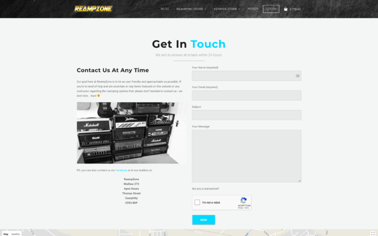
In the case your customers have questions not answered by your Support page, or they want to contact you for some other reason, you’ll want to be reliably available with a industry-standard Contact page. There are a variety of contact form plugins available, allowing you to present a clean and minimal contact form that you can customize any way you like.
Include a lead-in that acknowledges your customers and makes them feel welcome to contact you. The last thing you want is to put people off when they need help with your products! You’ll want to decide how to structure your contact process; will you respond within 24 hours? 48 hours? Offering great customer service is crucial, but considering your company size and resources, remember to only promise your customers what you can actually fulfill!
Account
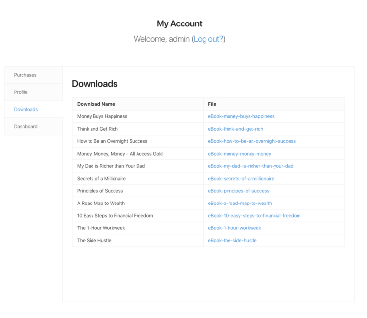
This is where your customers will go to see their account dashboard, and can include things like purchase history, personal and payment information, and even recommended related products. Make it possible (and simple) for people to change any of this information, and place customer purchases as the first thing they see (to avoid any confusion).
Creating your Account page with an enjoyable user experience in mind makes for happy customers – conversely, if your website is cumbersome to use, you may lose business! So, put yourself in the customer’s shoes and create something that is clean, minimal, and easy to navigate:
End User License / Purchase Terms & Conditions
Per the nature of digital goods, when customers buy your products, they are actually purchasing a license to use your products. To avoid any conflicts or misunderstandings about this, you’ll want to display your complete end user license agreement as its own page on your website. Be as transparent and forthcoming as possible to protect yourself from unwarranted claims as well as any unauthorized use of your products.
Using simple and straightforward language in your license agreement can increase understanding and foster customer trust; the last thing you want is to be seen as someone who intentionally tricks people with legalistic language that’s difficult to parse. Consolidating your license into smaller sections can make it easier to read, and more importantly – difficult to misinterpret!
Refund Policy
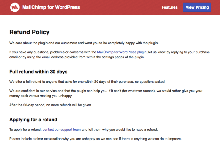
Refunds are extremely common when it comes to online purchases. For this reason, it’s important that you communicate your refund policy as well as your purchase terms and conditions (that govern the use of your site and products) as upfront and clearly as possible; there’s nothing worse than having to defend yourself due to poor planning, loopholes in your terms, gray areas in your refund policy, or similar issues. Avoid the hassles altogether by making your policy air-tight, and forthcoming.
Because digital products are intangible, some digital product websites do not offer refunds. If you sell software, web app memberships, etc., or if your products come with a high price tag, you may decide to offer a money back guarantee or a specific refund period. You may also suggest that customers back up their orders to protect against loss, and retain their order confirmation and purchase receipts in the case of any future discrepancies. All of these things should be included in your refund policy.
Keep your language friendly, yet straightforward – you want to let your customers know that you do care, and that they are valued, while also asserting your policies upfront in the interest of protecting your business and providing customer satisfaction. Check other digital product store websites to see what your competitors and role models are doing; there’s plenty of good examples to use as a guide for creating your website!
Blog
Whether you want to simply share updates, news, and your expert opinions, or bring in extra traffic to your site via content marketing, creating a blog page takes little effort; (if you’re a WordPress user) just categorize your posts under “blog” and they will automatically display in chronological order on your blog page.
Bring it all together
A well-done digital product website can be a work of art! Once you have the basic anatomy down, you can start tweaking and customizing everything, crafting your site into something that reflects your brand vision the way you see it. It can take some time to get everything in place and working seamlessly, but hopefully this guide can help you put the pieces together and make your dream a reality!
Here’s a quick checklist to help you work through the base anatomy of a site to get your store up and running:
- Product pages
- Homepage
- Pricing
- Checkout
- About
- Support
- Contact
- Account
- End User License / Purchase Terms & Conditions
- Refund policy
- Blog
What are the key components of your own digital product website? Is there anything you’d like to share that we haven’t included in this post? Comment below to join the conversation.
