If you want your digital product brand to stay relevant and at the top of the customer’s mind, it’s good to shake things up sometimes!
This is not to say that your brand shouldn’t be consistent, or that you should be constantly changing things on a whim – that could actually be disorienting for the customer and perhaps even cause them to lose interest.
What I’m talking about is freshening up your digital product brand periodically in order to prevent stagnancy and keep your customers engaged and interested.
Maybe you’re experiencing a lull in sales, or new competitors have shown up on the scene. Perhaps your store has been around for a while and it’s just time for a change.
Regardless, the changes you implement don’t need to be huge; After all, we’re not talking about doing a complete re-brand! However, a few simple tweaks or new additions could take things from yesterday’s news to today’s vogue nearly overnight.
At the very least, they can breathe a bit of new life into your brand!
But, what elements should you focus on?
In this week’s edition of The EDDit, we look at 5 quick and easy ways to freshen up your digital product brand!
1. Refresh your imagery
If you’re like most digital product store owners, your brand probably exists exclusively (or mostly) online. That means that the visual element is extremely impactful when it comes to building and maintaining a customer base.
It follows, then, that the imagery you use is an important piece of your brand puzzle – and it should be one of the first things you consider when freshening up your digital product brand.
Product artwork
Consider changing your product artwork to reflect modern design trends. For example, you could keep the same colors, but create a more clean and minimal design with new typography. Or, you might decide to refresh existing product artwork with updated product photos, stock photos, or new-and-improved graphic designs.
In this example, product creator photos were added, and the design was updated for a sleeker, more modern look:


Social media images
Your social media accounts are some of the best places to generate new buzz and momentum around your digital product business. So, updating your look on these platforms can make a big difference when it comes to revitalizing your brand.
On platforms like Facebook, for example, even just the simple act of updating your profile image or featured image puts you into the news feed – in front of your audience. At the very least, it gives you something new to post about, and shows customers that you’re actually relevant and paying attention.
Updating your social media images is also an opportunity to showcase new products. For example, LogoMood updated their Facebook cover image from this:

to this:
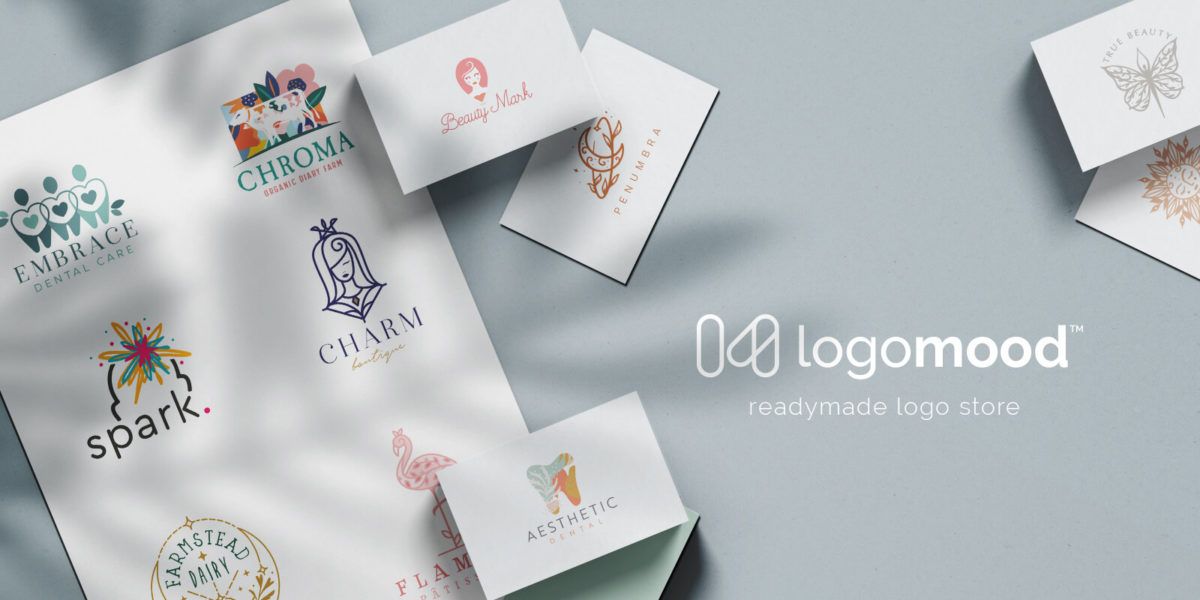
Both images showcase LogoMood logo designs, but the updated image is professional quality with a cleaner, more modern look.
Remember that it’s important to have a uniform look across all platforms if you want to maintain consistency with your brand image, so if you update one social account, you’ll probably want to update all of them.
If you make your own graphics, sites like SocialSizes.io and BrandPacks have free templates for Adobe Photoshop (and similar software) that you can download with all of the current image dimensions for different platforms.
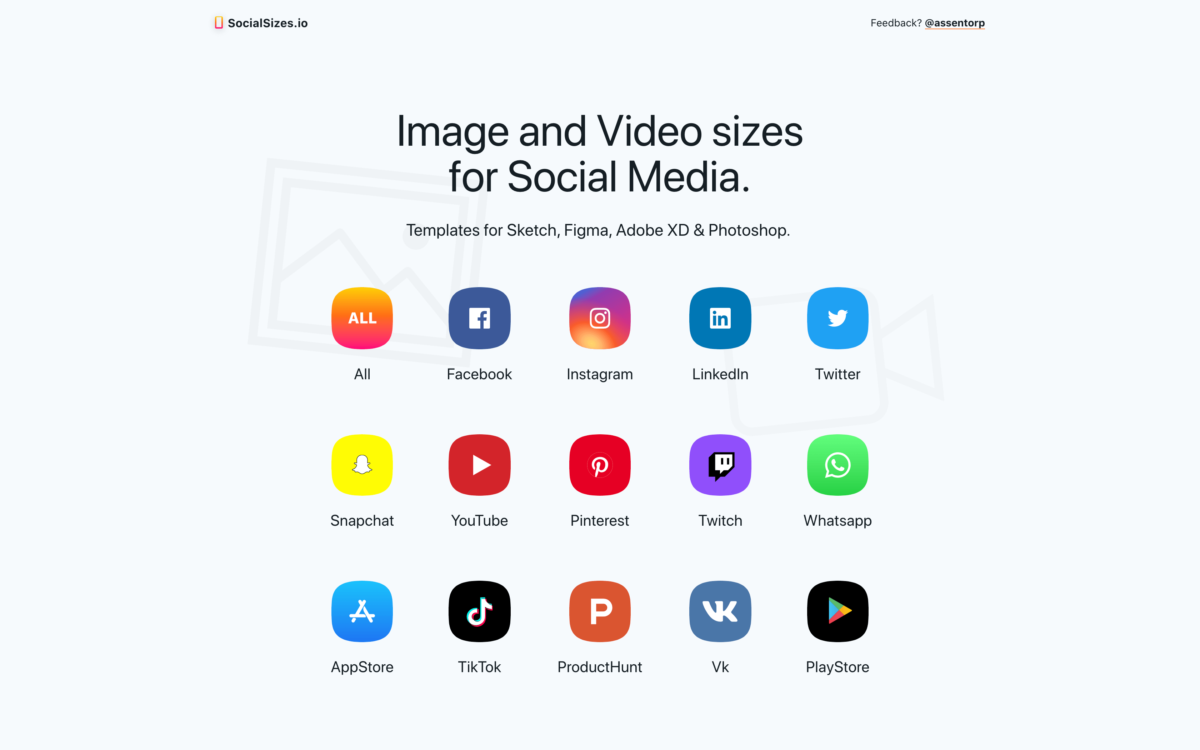
This makes it easy to batch create and export all of the graphics you need for your different accounts.
Website visuals
Perhaps a more obvious change you can make to your brand is updating your website visuals. This can include – as mentioned above – product artwork, but it can also include things like:
- Product creator headshots or logos
- Testimonial headshots
- Screenshots of your product features
- Screenshots or videos of real-world uses of your products
- Other videos you may have or want to add, such as introduction videos, sales videos, etc.
If you already create regular video content, you could update the design of your YouTube thumbnail images, or create a new motion graphic intro, for example. Or, you might consider making animated GIF images from existing video content to use as backgrounds or featured images on different web pages.
2. Tweak your brand tone
With so much noise and saturation in the marketplace today, it can be hard to keep the attention of your audience. This is where brand tone comes in.
The language and writing style you use on your websites, social media accounts, and other communication channels is often overlooked, but it’s a powerful element that affects the customer’s perception of, and desire to engage with your brand.
In fact, there may be simple changes you can make to your brand tone right now that will help you better connect with your audience, and make your brand more memorable, more attractive, and more trustworthy to customers.
If you haven’t already, consider applying these brand tone tips:
- Know your audience.
Before you can update your brand tone to fit your audience, you need to know who they are. If your audience is young and trendy, they might respond better to casual language and pop culture lingo, for example. If they are older professionals, you may have better results with traditional language and a more professional writing style.
- Decide what your brand tone actually is.
Do you want to be seen as serious, professional, friendly, or funny? How would you describe your competitors’ brand tones, and how does your audience respond to them? How can you distinguish yourself while honoring your niche industry standards?
You might decide that tweaking your brand tone to be more friendly and casual has a positive impact on your business. Alternatively, it could be that your product is something that warrants a more serious or clinical tone.
It all depends on what you sell and what you want to achieve! - Keep it cohesive.
If more than one person writes copy or content on behalf of your brand, it’s important to decide on a standard tone that will be used by everyone. This avoids confusing customers and helps your audience more easily recognize and remember your brand.
Your brand tone also applies to any slogans, sayings, and catchphrases you use. If you don’t currently have a strong catchphrase, for example, creating one is a great way to freshen up your brand.
3. Spruce up your site design
Choosing a new theme, a more modern theme, or a theme with features that better suit your product type is a tried-and-true way to give your brand a fresh new look.
You might also decide to keep your existing site design, but tweak the colors. Just remember that you want to be reasonably calculated when it comes to altering design elements.
Changing your site design might seem like a bigger task, but it doesn’t have to be anything drastic. A new product category widget, a fresh home page layout, or cleaning up and consolidating your site navigation can make all the difference to your customers.
4. Modernize your typography
Being that the digital product sphere is so visual, typography is another mentionable element that has a big impact on the overall look and feel of your brand. Everything from your website copy to your product artwork, social media graphics, and logo can be affected by typography, so it’s worth thinking about.
Something as simple as choosing one or two new fonts can be enough to freshen up the whole experience for your customers. In general, the trends seem to be toward more clean, minimal, and contemporary aesthetics, but it all depends on your brand image and what you like!
5. Try out a new type of content
Lastly, diversifying your content can expand your brand reach – and bring you to entirely new territories.
Trying new types of content gives you the opportunity to take advantage of different platforms. For example, if you decide to add video to the mix, you have the ability to reach YouTube visitors that might not otherwise encounter your brand.
These new viewers can be converted into customers, which means more sales for you.
But, it’s more than just the money; Expanding your reach and diversifying your content adds exciting new facets to your brand.
Once you were just a store with a blog; Now, you’re a store with a blog and a video tutorial series (in this example). You’ve just become at least a little bit more interesting!
Plus, your existing audience will be thrilled to have new ways to consume your content. Even if you just duplicate existing content in new formats – such as recording an audio version of a blog post – you’re giving your audience more options for engaging with you, and you’re reaching a larger number of people across communities and platforms.
Here are just a few different types of content to consider incorporating:
- Apps, web apps, and software
- Blog posts
- Documents
- Downloadable creative assets
- Event livestreams
- How-to guides
- Informational videos
- Live Q&A videos
- Podcasts
- Tutorials (written, audio, or video)
- Vlogs
- Webinars
- Workbooks and product companion guides
A/B Testing
“If you’re not A/B testing your site, you’re leaving money on the table.”
CrazyEgg
Before you can make meaningful changes, it’s good to have a handle on what your audience responds to. But, if you’re like most digital product store owners, there is often a lot of experimentation involved.
A/B testing (or split testing) is a great way to measure the performance of the changes you’re making to see if they are producing better conversions. It involves testing multiple versions of a web page by showing them to users at random and collecting data on how well they perform.
There are a variety of tools available for A/B testing, such as Visual Website Optimizer.
“A/B testing is a fantastic method for figuring out the best online promotional and marketing strategies for your business. It can be used to test everything from website copy to sales emails to search ads.”
Neil Patel
A/B testing helps guide your choices, but you might still make certain decisions based on your aesthetic taste or brand vision – there’s nothing wrong with that!
Remember: Your brand is your creation, and you get to decide which direction to go with it.
Hopefully this post has given you some food for thought! Is there any advice you’d like to share? What have you done to freshen up your own digital product brand? We want to know, so leave a comment below!
Illustration by Jessica Johnston

